Creating a Converting Site
Thrivent's website needed more than a visual refresh—it needed a clearer, more intuitive digital experience to support its shift from a legacy insurance brand to a modern financial services company. I led the design and content strategy for a full site overhaul, redesigning the navigation, creating scalable templates, and running key conversion experiments while mentoring two senior designers. The new experience drove a 26% increase in advisor appointments, a 0.5% lift in conversion, and cut development time by about 65%.
Industry
Financial Services
Year
2025

Problem
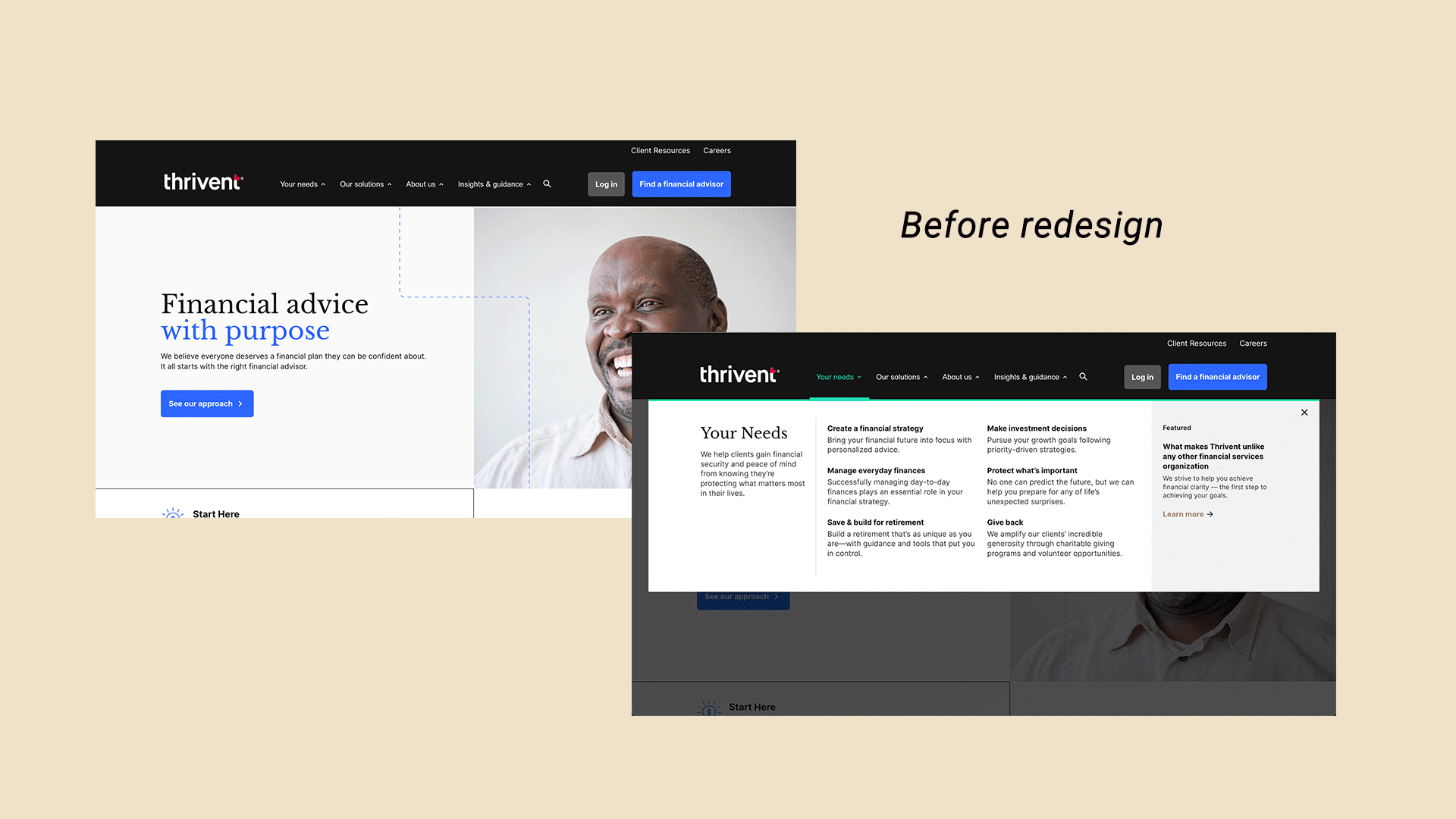
An unclear site structure not built to support user and business needs
Thrivent.com had low conversions (0.80%) due to an IA focused on business structure rather than user needs. A content audit showed duplication, outdated pages, and confusing taxonomy. Unclear navigation, inconsistent labeling, and complex paths made it hard for visitors to understand Thrivent’s offerings or take action. The site needed a user-centered IA to build trust and help prospects connect with an advisor.
Process
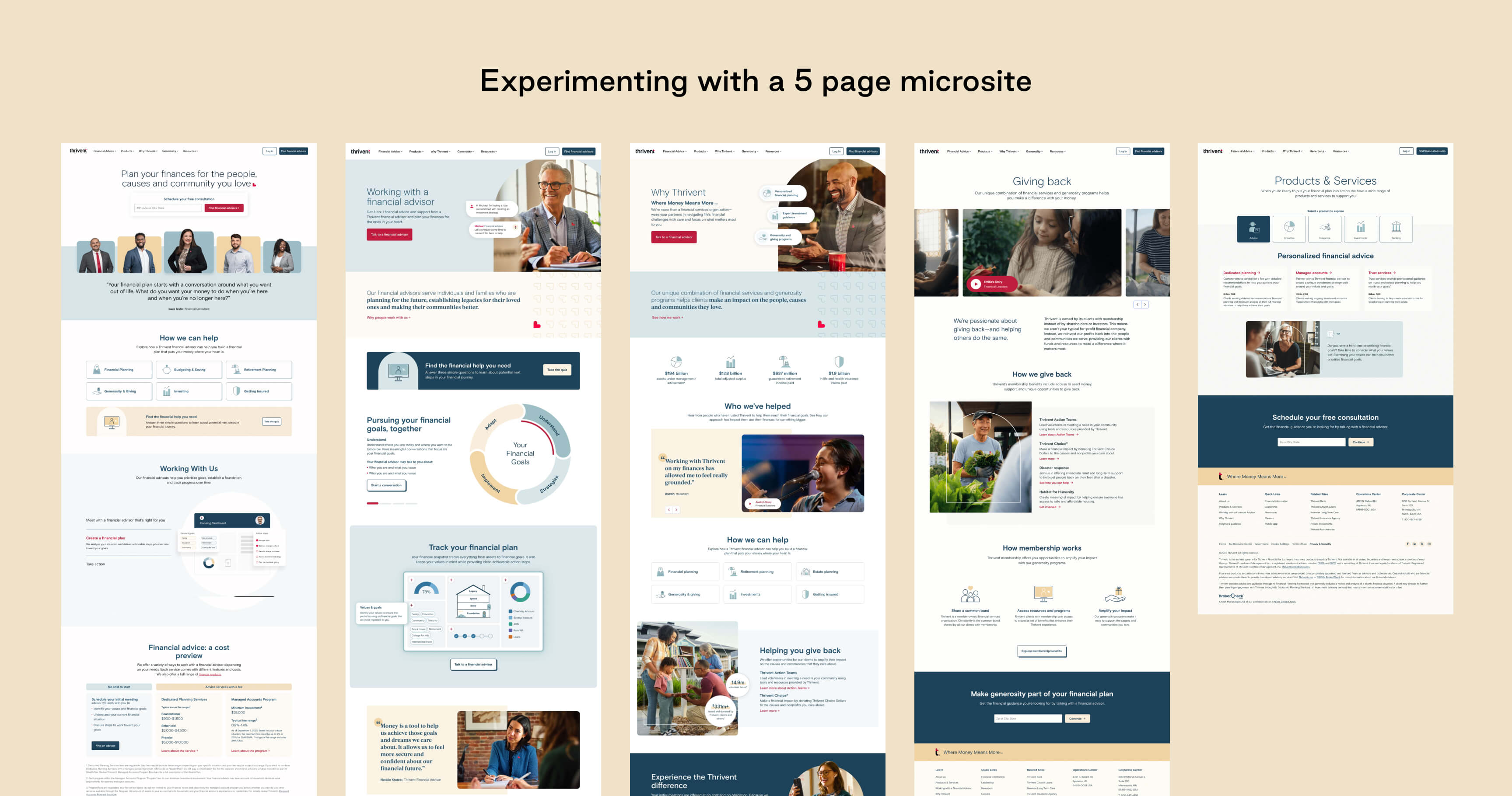
Testing a radically smaller footprint to inform new site architecture
We hypothesized that a focused 5-page microsite (shown above) addressing core user needs would reduce friction and improve conversion. When A/B tested, it outperformed the 700+ page legacy site, raising conversion from 0.80% to 1.80% and ultimately driving a full overhaul of the site’s IA and navigation.
Solution
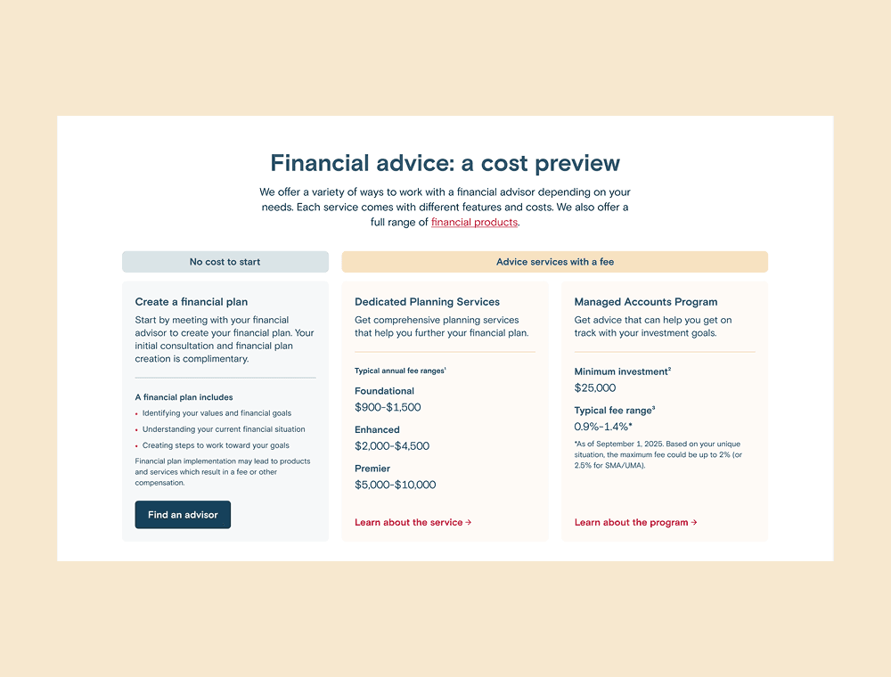
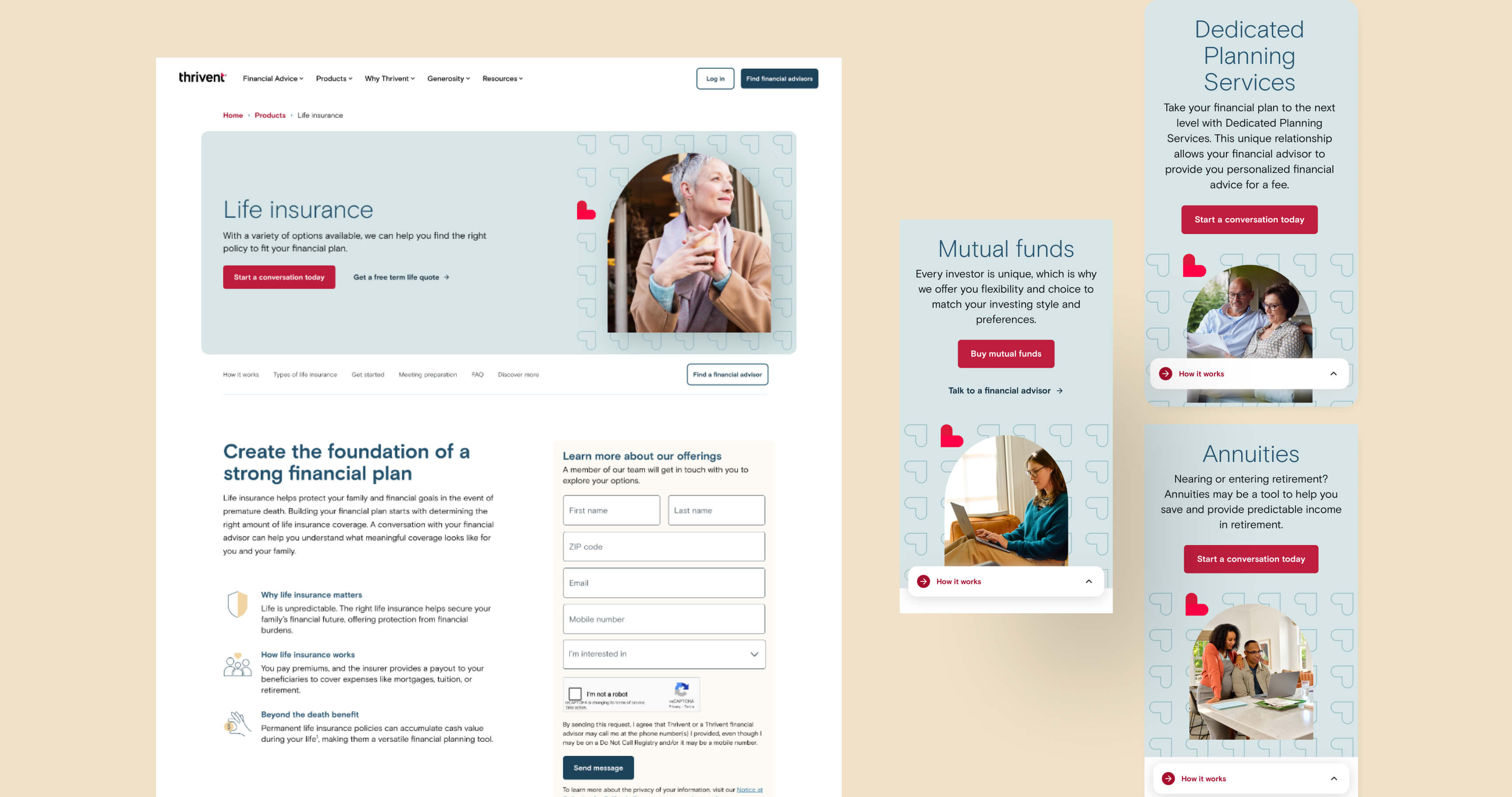
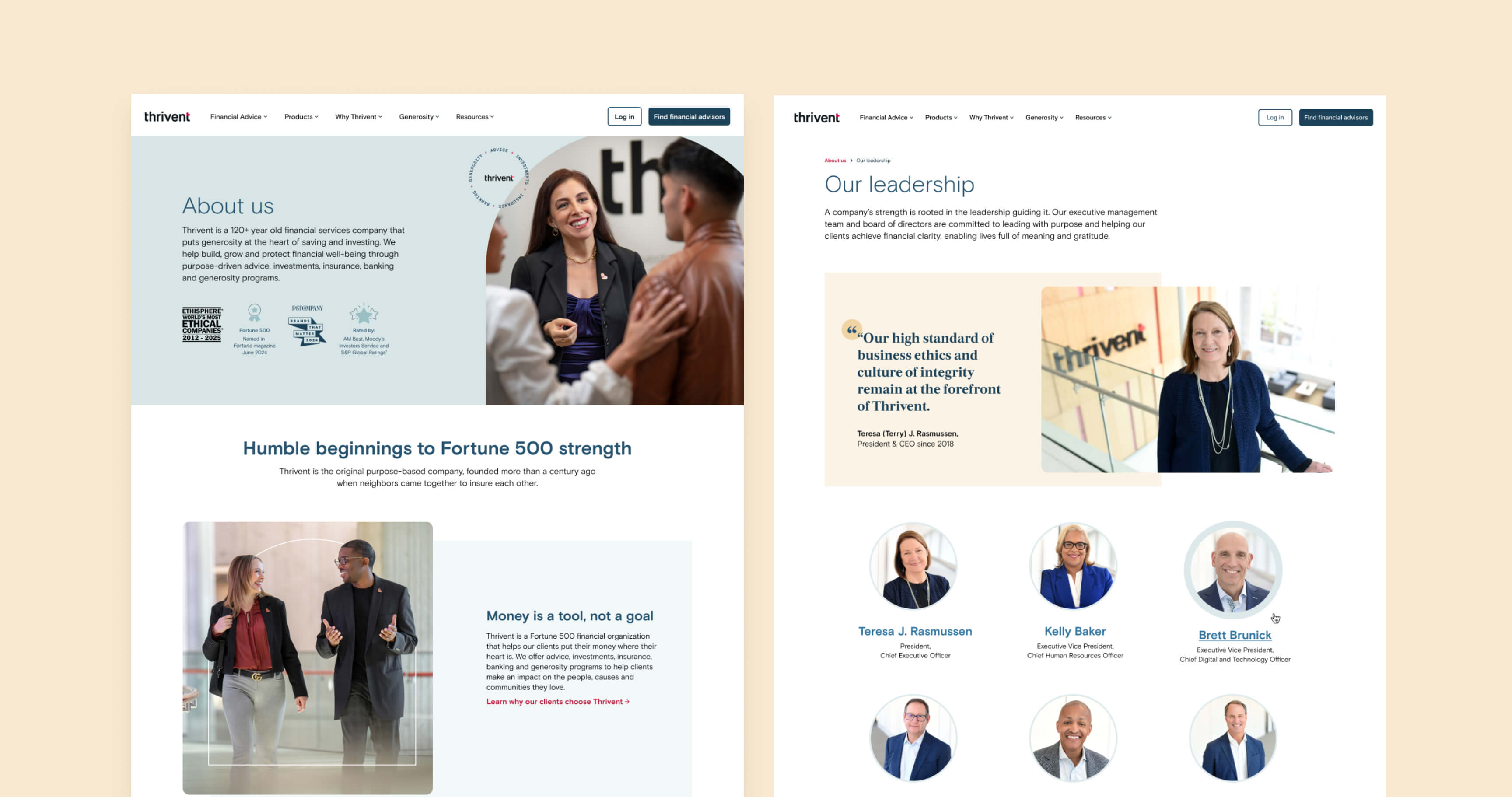
Simplifying a complex IA to drive clarity, trust, and conversion
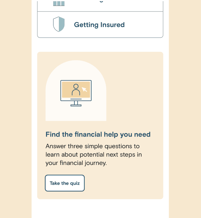
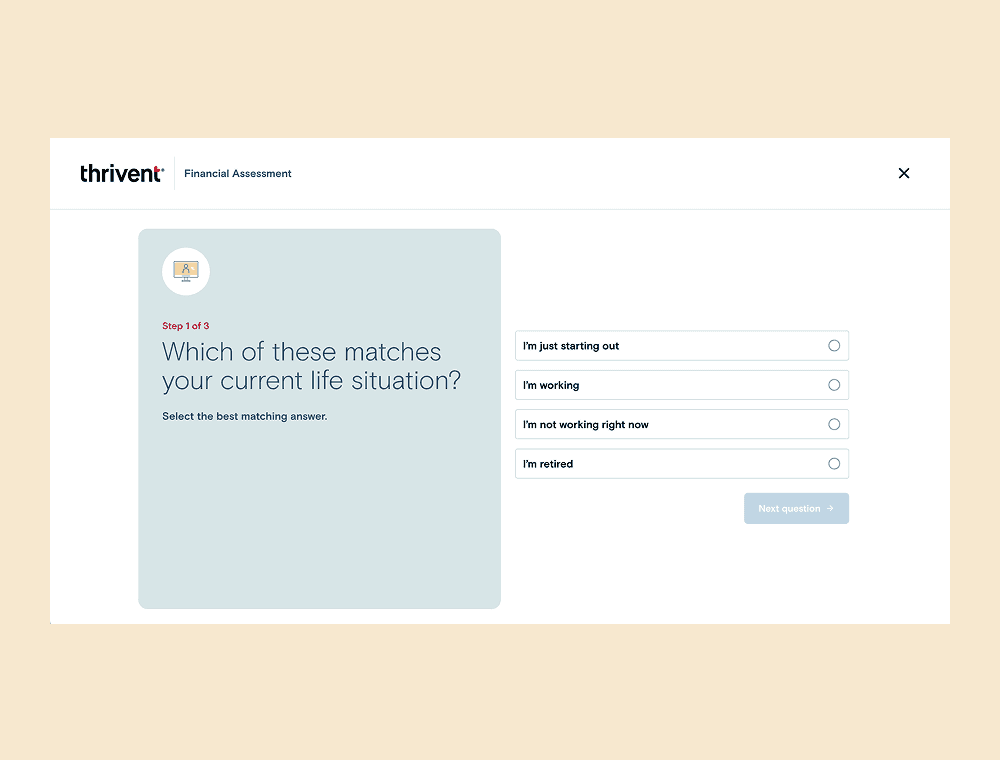
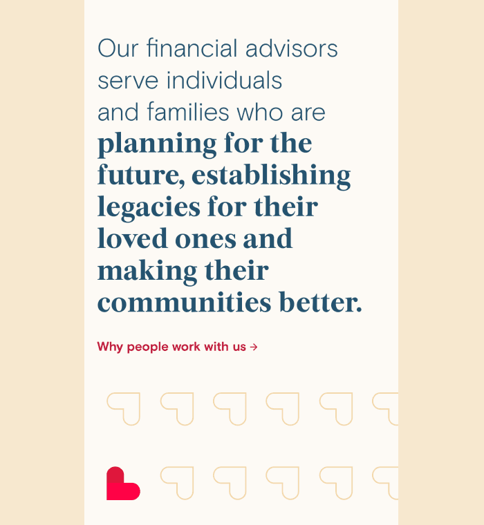
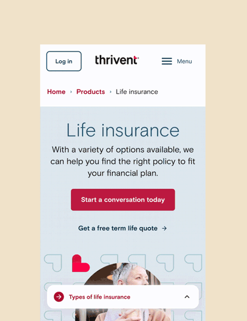
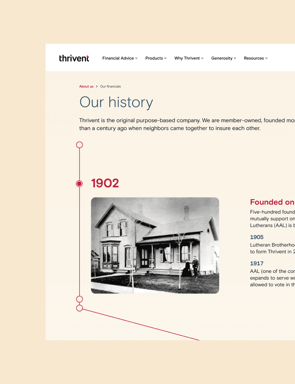
Partnering with product and engineering, we phased the overhaul of the site focusing on high-impact, conversion-driven sections and prioritized accordingly on the roadmap. We first overhauled the global navigation and footer, then created advisor-aligned product pages, a trust-building About Us section, and an MVP lead qualification quiz and guide for next steps.
Impact
From Complexity to Clarity: +43% Engagement, +26% Appointments
By modernizing the brand and rebuilding Thrivent’s digital system—including a clarified content strategy, intuitive global navigation, and scalable page templates—we created a more guided and consistent user experience. The results: 43% more users reached out, advisor appointments jumped 26%, product-page build time dropped 65%, and conversions rose 0.5%.